
Introduction
In modern web development, design and usability are just as important as functionality. While HTML provides the structure of a web page and JavaScript powers interactivity, CSS (Cascading Style Sheets) defines how everything looks—layout, colors, typography, responsiveness, and accessibility.
However, writing CSS from scratch for every project can be slow, repetitive, and error-prone. Developers often face challenges like:
- Re-implementing common UI elements (buttons, grids, modals).
- Ensuring cross-browser compatibility.
- Maintaining consistency across large projects.
- Making designs responsive for different devices.
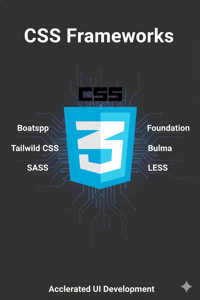
To solve these problems, developers turn to CSS frameworks—collections of prebuilt styles, components, and utilities. Frameworks help streamline development, enforce design consistency, and improve maintainability.
Among the many CSS frameworks available today, three have become especially popular: Bootstrap, Tailwind CSS, and Material UI. Each takes a different approach to styling and offers unique benefits. This article explores their history, features, strengths, weaknesses, and best practices to help you choose the right one for your project.
Part 1: What is a CSS Framework?
A CSS framework is a prewritten library of CSS code that provides:
- Grids and Layouts – predefined responsive structures.
- Typography – font sizes, line heights, headings, and paragraphs.
- UI Components – buttons, forms, navigation bars, modals.
- Utilities – helper classes for margins, paddings, alignment, colors.
- Responsive Design Tools – media queries and breakpoints.
The goal is to let developers focus on building features, not reinventing CSS basics every time.
Part 2: History of CSS Frameworks
- 2007–2010: Early frameworks like Blueprint and 960 Grid System focused mostly on grids.
- 2011: Bootstrap emerged from Twitter, revolutionizing front-end design with responsive layouts, components, and JavaScript plugins.
- 2015–2017: Google popularized Material Design, leading to frameworks like Materialize and later Material UI.
- 2019–Present: Tailwind CSS introduced a utility-first approach, where developers style directly in HTML using atomic classes.
Each of the three frameworks we’re focusing on—Bootstrap, Tailwind, Material UI—represents a distinct philosophy of CSS usage.
Part 3: Bootstrap
Overview
Bootstrap, created by Twitter engineers Mark Otto and Jacob Thornton in 2011, is the most widely adopted CSS framework in history. It offers a component-based approach, bundling predesigned UI elements with a responsive grid system.
Key Features
- Grid System – Responsive, mobile-first flexbox/grid layouts.
- Prebuilt Components – Buttons, forms, alerts, navbars, modals, tooltips.
- JavaScript Plugins – Dropdowns, carousels, modals (using vanilla JS or jQuery in earlier versions).
- Theming – Sass variables for customization.
- Cross-Browser Support – Works across major browsers.
Example Usage
<div class="container">
  <div class="row">
    <div class="col-md-6">Left Column</div>
    <div class="col-md-6">Right Column</div>
  </div>
</div>
Advantages
- Fast prototyping with ready-made components.
- Large ecosystem of templates, themes, and tutorials.
- Responsive by default, with built-in breakpoints.
- Beginner-friendly for new developers.
Drawbacks
- Can lead to “Bootstrap look”, making websites look similar.
- Code bloat if many components go unused.
- Overriding default styles can be tricky.
Best Use Cases
- MVPs and prototypes.
- Corporate websites.
- Content-heavy sites requiring consistent UI.
Part 4: Tailwind CSS (Utility-First)
Overview
Tailwind CSS, released in 2017 by Adam Wathan and his team, popularized the utility-first approach to styling. Instead of predesigned components, it provides atomic utility classes like p-4, bg-blue-500, flex, or text-center. Developers combine these classes directly in HTML to create custom designs.
Key Features
- Utility-First Classes – Build designs without writing custom CSS.
- Responsive Variants – Mobile-first classes like
md:,lg:,xl:. - Customization – Configurable theme with
tailwind.config.js. - JIT (Just-In-Time) Compiler – Generates only used styles, reducing file size.
- Integration – Works well with React, Vue, Angular, etc.
Example Usage
<div class="grid grid-cols-1 md:grid-cols-2 gap-4">
  <div class="p-6 bg-blue-500 text-white">Left</div>
  <div class="p-6 bg-green-500 text-white">Right</div>
</div>
Advantages
- Highly customizable – Tailor styles to match branding.
- Performance – Small final CSS file (with JIT).
- Design consistency via reusable utilities.
- No need for context switching between CSS and HTML.
Drawbacks
- Steep learning curve for beginners.
- Cluttered HTML due to many utility classes.
- No prebuilt components (though community libraries exist).
Best Use Cases
- Custom UIs where branding is essential.
- SaaS products and dashboards.
- Teams with design systems in place.
Part 5: Material UI
Overview
Material UI (MUI), launched in 2014, is a React component library based on Google’s Material Design guidelines. Unlike pure CSS frameworks, it combines CSS + JavaScript to provide ready-to-use components like buttons, cards, and dialogs.
Key Features
- Material Design Components – Following Google’s design language.
- Theming – Customize colors, typography, spacing.
- Component API – Highly configurable props.
- Accessibility Support – ARIA attributes and best practices.
- Integration – Built specifically for React.
Example Usage
import Button from '@mui/material/Button';

export default function App() {
  return (
    <Button variant="contained" color="primary">
      Click Me
    </Button>
  );
}
Advantages
- Professional design aligned with Material Design.
- Rich ecosystem of React components.
- Built-in accessibility features.
- Customizable themes with simple overrides.
Drawbacks
- React-only, not usable with plain HTML.
- Larger bundle sizes if many components are imported.
- Opinionated design—harder to deviate from Material style.
Best Use Cases
- React applications.
- Enterprise dashboards.
- Apps needing Material Design consistency.
Part 6: Comparison of Bootstrap, Tailwind, and Material UI
| Feature | Bootstrap | Tailwind CSS | Material UI |
|---|---|---|---|
| Approach | Prebuilt components | Utility-first | React component library |
| Customization | Sass variables | Full config file | Theme overrides |
| Ease of Use | Beginner-friendly | Steep learning curve | Easy (if using React) |
| Ecosystem | Huge | Growing rapidly | Strong (React-based) |
| Best For | Prototypes, websites | Custom UIs, SaaS | React apps, dashboards |
| File Size | Larger (needs purge) | Small (JIT) | Larger, depends on usage |
Part 7: Choosing the Right Framework
- Use Bootstrap if:
- You want fast prototyping.
- You prefer prebuilt, styled components.
- You’re building a traditional website.
- Use Tailwind CSS if:
- You need full design freedom.
- You want highly optimized CSS output.
- You’re building a modern SaaS or custom UI.
- Use Material UI if:
- You’re working with React.
- You want Google’s Material Design look.
- You need accessibility and polished UI out of the box.
Part 8: Best Practices When Using Frameworks
- Don’t overuse defaults – Customize for brand identity.
- Purge unused styles – Tools like PurgeCSS (Bootstrap) or Tailwind JIT help.
- Keep consistency – Choose one framework, don’t mix too many.
- Test responsiveness – Verify designs on multiple devices.
- Follow accessibility standards – Frameworks help, but testing is still necessary.
Part 9: Future of CSS Frameworks
- Utility-first adoption – Tailwind’s approach is influencing new frameworks.
- Component-driven ecosystems – React, Vue, Angular libraries merging CSS + JS.
- Design tool integration – Direct export from Figma/Sketch to CSS frameworks.
- Performance-first mindset – JIT compilation, tree-shaking, and modular CSS.
Conclusion
CSS frameworks are essential tools for modern web development.
- Bootstrap remains a reliable choice for fast development with prebuilt components.
- Tailwind CSS gives developers unmatched customization with utility classes.
- Material UI provides polished, accessible, React-based components aligned with Google’s Material Design.
Choosing the right framework depends on your project: traditional websites may benefit from Bootstrap, custom apps thrive with Tailwind, and React-based enterprise apps shine with Material UI.
Leave a Reply